Socials & decks
Social posts, sales slides and delivery slides — with original artwork and reference imagery.
| Touchpoint | Job | Backgrounds | Type | Use | Avoid |
|---|---|---|---|---|---|
| Website | Explain and convince, one scroll | hero-bg, story-bg, quote-bg, page-frame | Anek Latin · Kode Mono eyebrows | SiteHeader, Hero, StorySection, UseCases, UseCaseTemplate, CustomerQuote, SiteFooter | Aura backgrounds, Doto numbers in body copy, slide chrome |
| App | Get work done, calm and dense | PlatformShell ambient / flat, glass panels, lavender nav — light & dark | Anek Latin · Kode Mono small labels | PlatformShell, PlatformNavItem, AppHeader, Card (glass), DataChip, Button (sm) | Marketing gradients, auras, photos, gem visual, marketing headlines |
| Socials | Stop the scroll, one message per post | light (dot grid), aura, magenta, blend, night, photo | Anek Latin · Kode Mono tags · Doto numbers | SocialPost, LinkedInBanner, Tag, StatCard, HexPortrait, IMAGERY | More than one aura colour per post, long paragraphs, magenta for data topics |
| Sales slides | Persuade a prospect, big and visual | aura / night title, light content, blend for the one focal slide | slide-title-lg, slide-subtitle · Doto stats | Slide deck="sales", StatCard size="canvas", Tag, IMAGERY.gemCrystal, story diagram visuals | Dense tables, client names on every slide, more than 3 bullets |
| Delivery slides | Report to a customer, clear and traceable | light (page-frame) content, story title slide | slide-title, slide-body, slide-kicker | Slide deck="delivery" with context + SlideFooter, SlideKicker, tables, timelines | Aura, gem, photos, Doto numbers, marketing claims |
Designer brand elements
Original artwork from the new brand kit. The faceted gemstone identity is available alongside the existing shield; existing pages keep their current logo.










Trusted data.
Confident decisions.
Your policies.
Your AI's context.
Code
<Logo edition="designer" variant="full" tone="auto" />
<Logo edition="designer" variant="mark" tone="magenta" />
<Logo variant="wordmark" tone="dark" />
<img src={BRAND_ARTWORK.gemstones.violet} alt="" />
Print masters · PDF and EPS
Socials
Portrait 1080×1350 posts and carousels. Light for explaining, aura for statements, night for events and jobs, magenta for people and documents, blend for the closing call to action.
 Use Case
Context matters.
We help you shape it.
Agents only cite the right numbers when they know your house rules.
No one told AI your
enterprise's house rules.
Agent-driven mapping turns months of work into weeks



Meet us
at the CDO Conference
15 June 2026
Amsterdam

Let's see
your mess
We map it and show the ROI. Then you decide whether to scale.
Book a scoping call
Meet our new
colleague, Sara
AI Engineer
Meet our new
colleague, Emma
"Manually, this would be a multi-year program. With Metagem we fix the quality conflicts that actually matter."
Marc Dubois
Chief Data Officer
No one told AI your
enterprise's house rules.
Sales slides
Prospect-facing. Designer frame chrome, big statements, aura titles, Doto proof numbers. One idea per slide.
The Future of AI for Data Teams
Proof from the first six weeks
Findings tied to business KPIs
Agent-driven mapping
Auto-derived from sources
To reach shared goals, we need a shared vocabulary.
Delivery slides
Customer project decks. Quiet, readable, traceable: kicker, title, content, and a footer with client, date and page number.
Proving customers are real and well documented
Why customer identity matters now
Code
<Slide deck="delivery" page={2} total={11} context="Client · Project · 21/10/2026">
  <SlideKicker>The question</SlideKicker>
  <h2 className="slide-title mt-6">Why customer identity matters now</h2>
</Slide>
Brand imagery
From the designers' kit. Portraits are illustrative brand photography — never present them as real customers or staff.







Mockups
Reference examples from the designers: how the brand looks on a screen and on event roll-up banners.
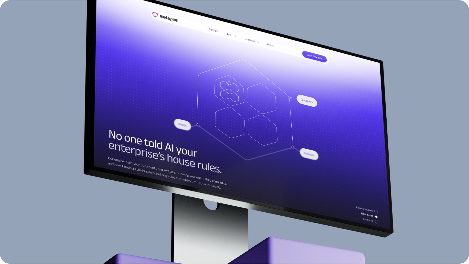
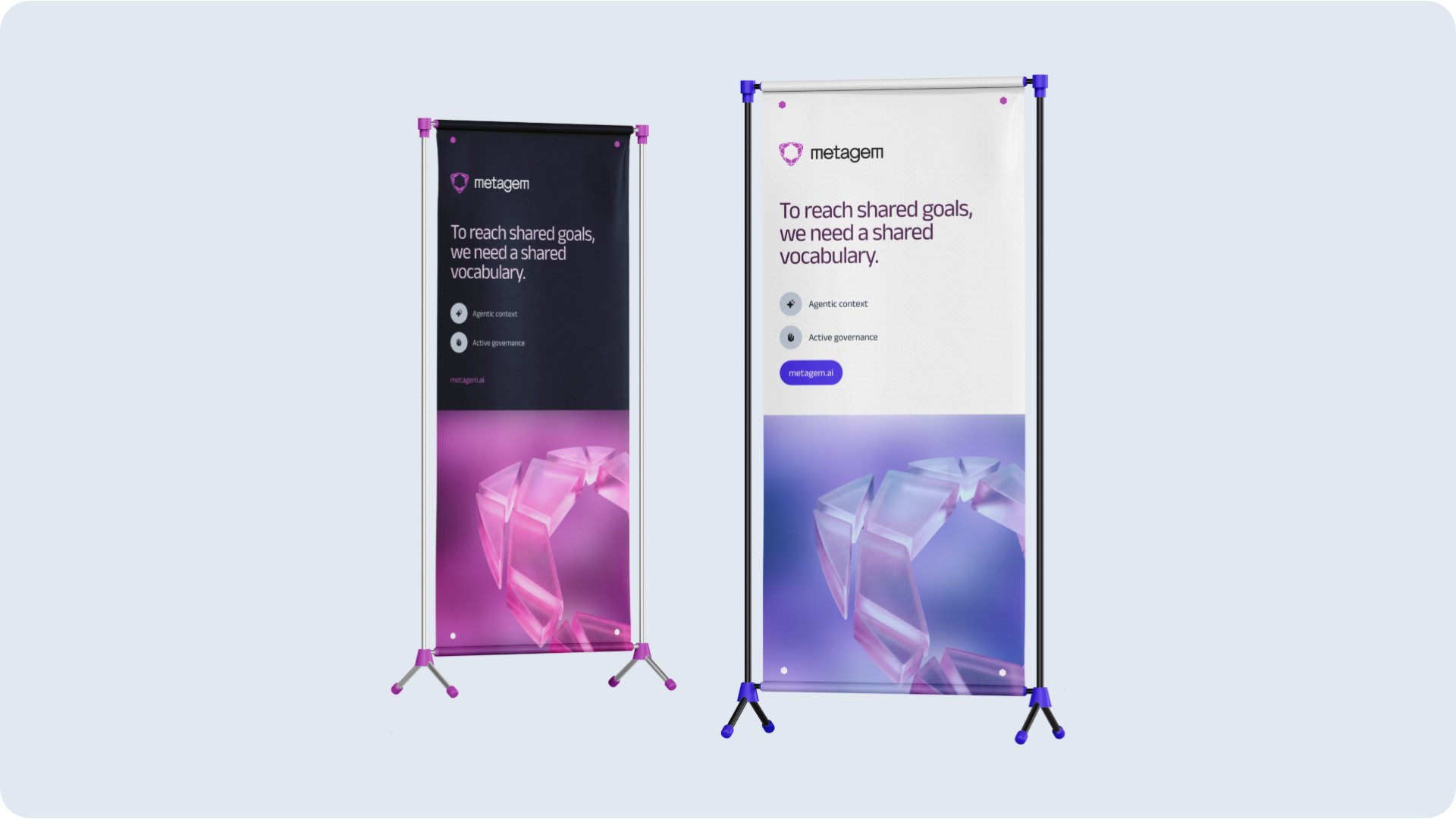
Photo prompt
The Midjourney prompt behind the brand portraits. Keep the style words, change only the person and setting.
Code
import { PHOTO_PROMPT } from "@/design-system/metagem";
Social sizing & safe areas
From Social Graphics Template. LinkedIn crop and overlap guides are approximate; validate each upload on its destination.
LinkedIn portrait post
1080 × 1350 px4:5 feed post. Source layout uses 80px side/bottom margins and 72px top margin; designer chrome uses its own insets.
LinkedIn personal banner
1584 × 396 pxApproximate — LinkedIn publishes no official overlap specification. Keep essential content in x 568–1307 and validate in the destination profile.
LinkedIn company banner
1128 × 191 pxApproximate — logo overlap and crop vary by device. Source composition keeps essential content in x 336–1008 and omits the repeated wordmark.
WebinarGeek banner
1940 × 388 pxSource crop model: tablet centre 1164px (x 388–1552), mobile centre 776px (x 582–1358). Title/date belong in the mobile band; speakers in the tablet bands; edge artwork is optional.
Portrait hierarchy
Brand → headline → proof → speakers → when + action. Source post margins: 80px sides/bottom, 72px top; readable post text ≥18px native. Keep Metagem's three-level hierarchy.
Native PNG export
Export at 1× or optional 2×, never from the scaled preview. Wait for images and fonts; embed bundled fonts where needed. Crop overlays and controls stay outside the artwork.
Personal ≠ company
The existing LinkedInBanner is a legacy personal cover; its layout is not mobile-safe. Company covers use 1128 × 191 and omit the repeated wordmark. This source adds no carousel or PDF rules.
Code